A dental website fills the calendar when it answers a new patient’s questions faster than the practice down the street: Do you take my insurance, and what if I have none? Can you see me soon? What will this cost? Will I feel judged or rushed? Are you actually good? If each of those questions has a clear answer one tap away on a phone, more visitors book. If they have to call to find out, many simply try the next result.
This guide is for practice owners and office managers planning a new dental website or a redesign. It follows the path a new patient takes before booking, then covers the photo, review, privacy and accessibility rules that trip up dental sites more than most.
This article is general information, not legal or compliance advice. Check privacy, advertising and accessibility questions with your own advisor or state dental board.
Most people choosing a dentist are not comparing logos. They are checking a short list of practical worries. Map every worry to a place on the site where it is answered.
| Patient question | Where the site should answer it | What a good answer looks like |
| Do you take my insurance? | Insurance page, linked from the header and booking page | Plans you are in-network with, plus a plain note on out-of-network claims |
| I don’t have insurance. Can I still afford this? | No-insurance or membership plan page | What the plan covers, the price, and any financing options you offer |
| Can you see me soon? | Emergency page and booking button | Same-day policy, after-hours instructions and a tap-to-call number |
| Will it hurt? Will I be judged? | First visit page, sedation or comfort page | What happens step by step, comfort options, a reassuring tone |
| Are you any good? | Team page, reviews, before-and-after gallery | Real photos, real credentials, real patient feedback |
| Where are you and when are you open? | Footer, contact page, location pages | Address, map, parking, hours and accessibility details |
On your current site, time how long each answer takes to find on a phone. Anything over about ten seconds is a gap.
Insurance is often the first filter. A vague line such as “we accept most insurance” makes patients call to check, and some won’t. Be specific instead.
You don’t have to publish a full fee schedule. But a short “what to expect to pay” section for common visits, such as a new-patient exam with X-rays, with a starting price or range and a note that the exam sets the real plan, removes a big reason to hesitate.
People search for an emergency dentist when they are in pain and ready to book. The page should say whether you see same-day emergencies, what counts as an emergency, what to do after hours, and when to go to an emergency room instead. Put a tap-to-call button at the top, not at the bottom.
Implants, clear aligners, veneers, crowns, sedation and children’s dentistry each attract different searches and different worries. A single “Services” page with a list of bullet points can’t answer them well. Each service page should cover who it suits, what the process involves, roughly how long it takes, cost and insurance notes, and common questions.
The National Commission on Recognition of Dental Specialties and Certifying Boards currently recognizes 12 dental specialties, including orthodontics, periodontics, endodontics and pediatric dentistry. States set their own rules on who can advertise as a “specialist,” and those rules differ. A general dentist who places implants can say so, but phrases like “implant specialist” may break your state’s advertising rules. Check with your state dental board before you publish.
Many adults put off the dentist because of fear or embarrassment. A calm page that walks through the first visit, from check-in to the exam to the treatment plan, does more than a gallery of smiles. If you offer comfort options or sedation, explain them plainly and say who is eligible.
Real results are persuasive, especially for cosmetic and implant work. They also carry real obligations.
Reviews influence both patients and local search results, so build a simple routine for asking happy patients to leave one, such as a text with a direct review link after the visit. Never pay for reviews, offer discounts for them, or post reviews written by staff. The FTC’s rule on fake reviews has applied since October 2024.
Replying is where dental offices get into trouble. In 2019, a Texas practice paid the HHS Office for Civil Rights $10,000 after replying to a Yelp review with a patient’s last name and health details. In 2022, a California practice paid $23,000 after OCR found it had disclosed patient information in its Yelp replies. The safe pattern is a reply that doesn’t confirm the person was a patient and offers to talk offline:
“Thank you for your feedback. We take every concern seriously and would welcome the chance to talk. Please call our office manager at [number].”
Online booking and digital new-patient forms save phone time and suit patients who search at night. Before you add them, check three things.
Our guide to medical practice website design goes deeper on privacy and patient portals for healthcare websites in general.
An accessible site has readable text sizes and contrast, works with a keyboard and screen reader, labels every form field and doesn’t hide key details inside images.
There is also a federal rule to know about. HHS’s 2024 Section 504 rule requires practices that receive federal financial assistance from HHS, which can include some Medicaid participation, to make their websites meet WCAG 2.1 AA. In May 2026, HHS extended the deadlines, and published summaries list May 11, 2027 for practices with 15 or more employees and May 10, 2028 for smaller ones. Confirm whether the rule applies to you and the current dates with your advisor, but building to WCAG 2.1 AA from the start is sensible either way.
Most dental searches are local: “dentist near me,” “emergency dentist,” “dental implants in [city].” The website and your Google Business Profile work together.
Cost depends mostly on page count, integrations such as booking and forms, and how much content and photography you need. At Blue IT Technologies, our Starter package covers up to 5 pages, delivered in 5 to 7 business days. Growth covers up to 10 pages plus a blog, with advanced SEO and speed optimization, in 10 to 12 business days. Multi-location groups or sites with complex integrations are scoped as Enterprise projects. We confirm the exact scope and price in a free consultation.
A single-location practice with service pages for implants, aligners and emergencies usually needs more than 5 pages, so plan your page list before you compare quotes. Our WordPress website cost guide explains what drives prices up or down.
Most single-location practices need a homepage, about and team, insurance and payment, new patients, emergency care, a page for each main service, reviews and contact. That is often 10 to 15 pages, plus location pages if you have more than one office.
You don’t need a full fee schedule, but starting prices or ranges for common visits and your membership plan help patients decide. Add a note that the exam determines the actual treatment plan and cost.
Yes, with a signed written authorization from each patient that covers marketing use. Without it, posting identifiable photos or details can be a HIPAA violation.
Yes, if the reply doesn’t confirm the person is a patient or mention any treatment details. Keep it short, polite and focused on inviting them to contact the office directly.
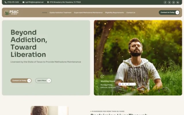
Our website design service delivers mobile-responsive, SEO-ready builds structured to support conversions. Blue IT has been building websites since 2015, and you can see healthcare and service business work, including Pasadena Clinic, in our case studies.
When you’re ready to plan your new site, contact us and tell us about your practice.

Talk to our team about your project. Book a free consultation, no obligation.